Aboriginal Ochre Painting Colour Palettes
The colours used by Aboriginal ochre painters are a unique set of colours that come straight out of the Australian earth. They are the warm colours of iron oxides that are prominent in all regions of the Australia continent. The colours vary from the deepest chocolate browns, through orange tones, tobacco reds and blood reds, through to lighter tones of yellows and creams, where there's more white clay involved. There is even a black oxide, although many Aboriginal artists use ground-up charcoal to make the carbon black for their paintings.
The ochre palette is a warm earth palette that the artist will then manipulate in their own way to create the story and images they desire. Each artist has personal preferences, and paintings can be analysed to locate the dominant colours, the key five tones that build the structure of the painting. These Kimberley paintings are mostly views constructed from an aerial perspective to show a wide view of Country. They represent the delineation of territory and the major features of the landscape. They show hills and valleys, rocky ridges and ravines, black soil or light sandy country, creeks and waterholes. Often the artist uses white dots to delineate these structural elements that are formed using blocks of earth colour.


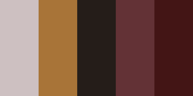
Rover Thomas | Bedford Station
Rover Thomas was the first ochre artist of the Kimberley to become famous above all others, partly because he was Australia’s representative at the Venice Biennale in 1990. He was the first Australian Indigenous artist to be given that honour. Rover’s paintings are mostly big simplified structures, but they’re full of complexities of colour due to the way he lays on the ochre paint. He sometimes paints back over and into the surfaces of the paint that gives the artwork not a flat finish, but a polychrome finish from the different blends of ochre. Some colours may find their way onto his brush that are slightly different to the original colours. As he lays colours on, the semi-transparent layers build up the tonal values. It is this kind of tonal quality combined with the incredible composition structures and the story that the artist is telling, that gives us a complex narrative. These are all held together by the harmonious ochre colours taken from the earth.
(Jap 006654)
View Rover Thomas

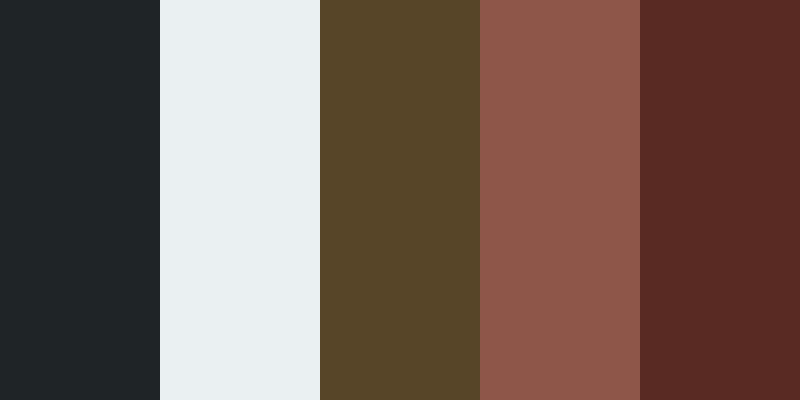
Freddie Timms | Dry Creek Plains Diptych
Freddie Timms like Rover Thomas, was a stockman. As a painter he is simplifying the structures down to the types of maps he carries in his head about the county that he mostly covered on horseback. Often Freddie Timms uses colour to delineate the type of soil structure of the country, so we have river floodplains and clay country and dry red dirt country. His palette reflects the more contrasting elements of the ochre palette. These go from white and off-white colours, through mid-greys and deep yellows and reds, through to a very crusty black, made very gritty from the particles embedded in the paint. Freddie Timms’ paintings are already toned back into blocks of colour that remain quite consistent in tone all the way through the area he is painting in each colour. The only exception is the rich texture that comes from the broken, gritty pigments that you can see on the paint surface.
(Jap 013416)
View Freddie Timms
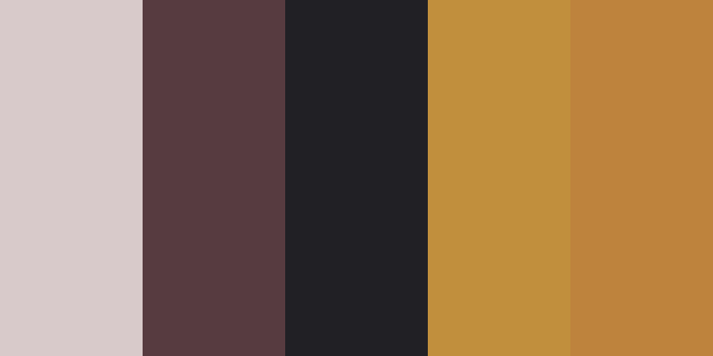
Jack Britten | Toolookwuning
Jack Britten is the artist most closely associated with Purnululu or the Bungle Bungles landscape. He tends to draw his colours from the colours seen in those famous beehive-shaped hills. They have been formed by the sediment deposited at the bottom of an ancient lake. The layers of sediment have been exposed after the lake has dried out and these hills were gradually eroded into shape by the wind and rain. The rounded hill shapes formed as the various layers of sediment have been broken down. You can see the clear bands of colour that run through the rock. Jack Britten selects a range of ochre colours that cover all the tones of browns, reds and yellows and he often separates them with dotted lines. These likely refer more to the dotted body paint designs made on dancers and performers for traditional ceremonies, but also places those man-made marks back into the landscape through the paintings.
(Jap 010412)
View Jack Britten

Hector Jandanay | Untitled Painting
Hector Jandanay was a respected and well-known Warmun artist, now deceased. His versions of the landscape are often quite organic in their look. They are even sometimes quite sexual in their references but remain landscapes. Hector would often draw from a broad range of ochre colours from gold and warm honey-brown colours, through to a chocolate brown and green. The green is a combination of a yellow oxide with a little bit of black pigment mixed into it, with this creating an olive green tone. Hector is combining symbols from the landscape along with references to human forms and is a very distinctive and individualistic artist in the way he uses the ochre materials and the compositions of his work.
(Jap 010496)
View Hector Jandanay
Queenie McKenzie | Joomaling – Bottle Tree
Queenie McKenzie is closely associated with the specific ochre colours that she used. These colours were mined from ochre pits on Texas Downs cattle station. Queenie paints with a range of pink colours, which can be anything from a dull rose pink through to a pale pinky brown colour. Queenie’s palette was modulated in a personal way, often being more delicate than many other ochre artists of the Kimberley. She would put together tones of colour that created a warm feeling, although she was also prone to using both black, white and grey ochre as compositional forms in her painting. Queenie’s fantastic hills, those rounded sets of hills, she would typically block up against a flat background to create the structure of the landscape, employing these wonderful ranges of pinks which were such a signature quality in her artwork.
(Jap 006142)
View Queenie McKenzie

Shirley Bray | Jimirowen – Kimberley Star, Gold Country
Shirley Bray is less well known in the Kimberley art world, but this is a fascinating painting reflecting the gold-bearing earth of the Kimberley where there were gold strikes in the late 19th Century. Shirley has employed tones of gold and golden brown and set it against a grainy black background, which is a method more commonly used by Aboriginal painters from the desert regions. This painting also employs white and deep brown as contrast colours, in an example of the colours of the earth just reflecting the subject matter that the artist is talking about.
(Jap 000940)
View Shirley Bray
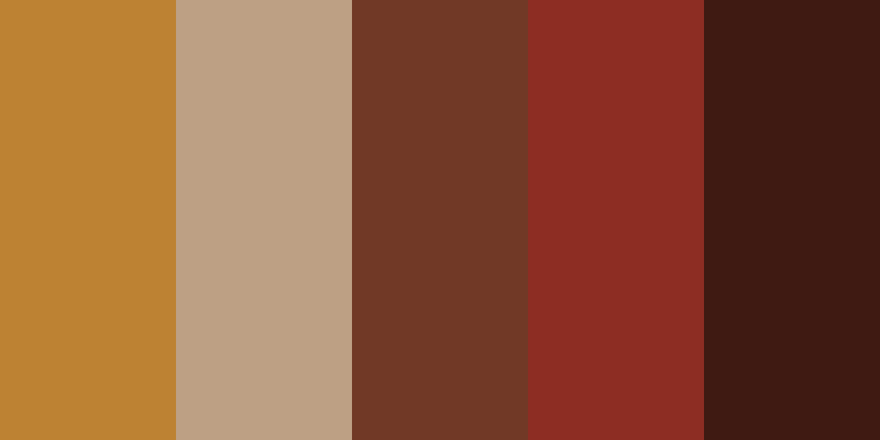
Freddie Timms | Beefwood Hole – Warabuny
Freddie Timms’ “Beefwood Hole Warabuny” painting again shows those use of heavy dark colours around the perimeter of the painting. These are blocking in the rocky ranges that are a dominant feature of the Kimberley landscape and they define the wide open plains seen in the centre of the painting. The plains are marked in a very soft pink colour, created from white ochre being blended with a small amount of red oxide to produce this tone. Freddie Timms creates a sense of spaciousness at the middle of these much darker blocks of colour, and then just one trail line running through, a track where stockmen would take the cattle through a particular yard or a particular watering place on the edge of that open country.
(Jap 014031)
View Freddie Timms

Jack Dale Mengenen | Gulun Duen Springs
Jack Dale Mengenen was a West Kimberley artist, so his style is different to those artists from the East Kimberley. Jack Dale was a storyteller. He depicted his important sacred sites from the country along the Gibb River Road. He was happy to draw on other non-earth pigments, so in this case he has used black, white and a mid-brown ochre, but he’s combined it with a strong red, which is more of a cadmium red, a mineral taken from other sources. It’s not an Australian earth colour. But he has used the dry pigment and mixed it with the same sort of binder and he has used some earth material in it to keep the same gritty kind of texture as the rest of the painting.
Jack Dale would often paint an aerial depiction showing the map of a sacred site where ancestral Creation events had occurred. Jack Dale’s country was closely connected to the Wandjina tradition of the West Kimberley. In these places the artist would paint the Wandjina image, the sign of the Ancestor and the Creator spirit, onto the rock face of the country. In that case we’re getting close to an artist who is drawing locations and important sites, and these sites themselves are what we might call artistic sites. They are sacred places with ceremonial paintings created all over the rock faces.
(Jap 010719)
View Jack Dale Mengenen

Marcia Purdie | Spearhead Dreaming – Jimbirla
Marcia Purdie is a younger artist who learned her painting skills from Shirley Purdie. She has a younger person’s vision of structure. She is still using the traditional ochre colours through the whole range of tones, through blacks, yellows, orange- browns, deep reds, through to creamy white colours. In this case Marcia has put many small marks, being spearhead marks, in rows of ochre colours, perhaps referring both to the types of small flints that people would locate in certain places to make spearheads, and also to mark the colours with alternating rows of red oxide, yellow oxide and occasional white flinty colours. These are placed on a black background, with Marcia Purdie showing a traditional Aboriginal site while using the colours that reference the use of the spearheads that were mined in that area.
(Jap 011299)
View Marcia Purdie
Queenie McKenzie | Dalyuyn Country
Queenie McKenzie’s “Dalyuyn Country” again shows that harmonious use of colour that is a feature of the artist’s work. In this painting she has blocked up the design into two main sections that are in gold, merging into a pale beige colour, and then the hills are marked in darker red-browns. Other hills and locations are marked in black with the whole structure outlined with the characteristic white dots. This is Queenie showing us how harmonious the colours are in her work and the beautiful results she gets using just the ochre colours mined from the landscape.
(Jap 013598)
View Queenie McKenzie